
We built a brand book, and it builds itself
Why Living Page has its own brand site, how the design system ended up inside Claude Design, and the route a new page takes from concept to production.
There is a particular kind of email you start getting once a product has been live for a while. Someone is writing about you, or listing you in a directory, or building an integration, and they want the logo. Usually they want it today.
The honest answer for a long time was to dig out an SVG, check it was the current one, and attach it. That works twice. After that it is a filing system held together by memory, and the version that ends up on someone else’s site is whichever one you happened to attach that afternoon.
So we built a brand book: brand.livingpage.app. Eight chapters — ethos, logo, colour, typography, motion, voice, assets and press. It is the answer to that email, and it is a few other things besides.
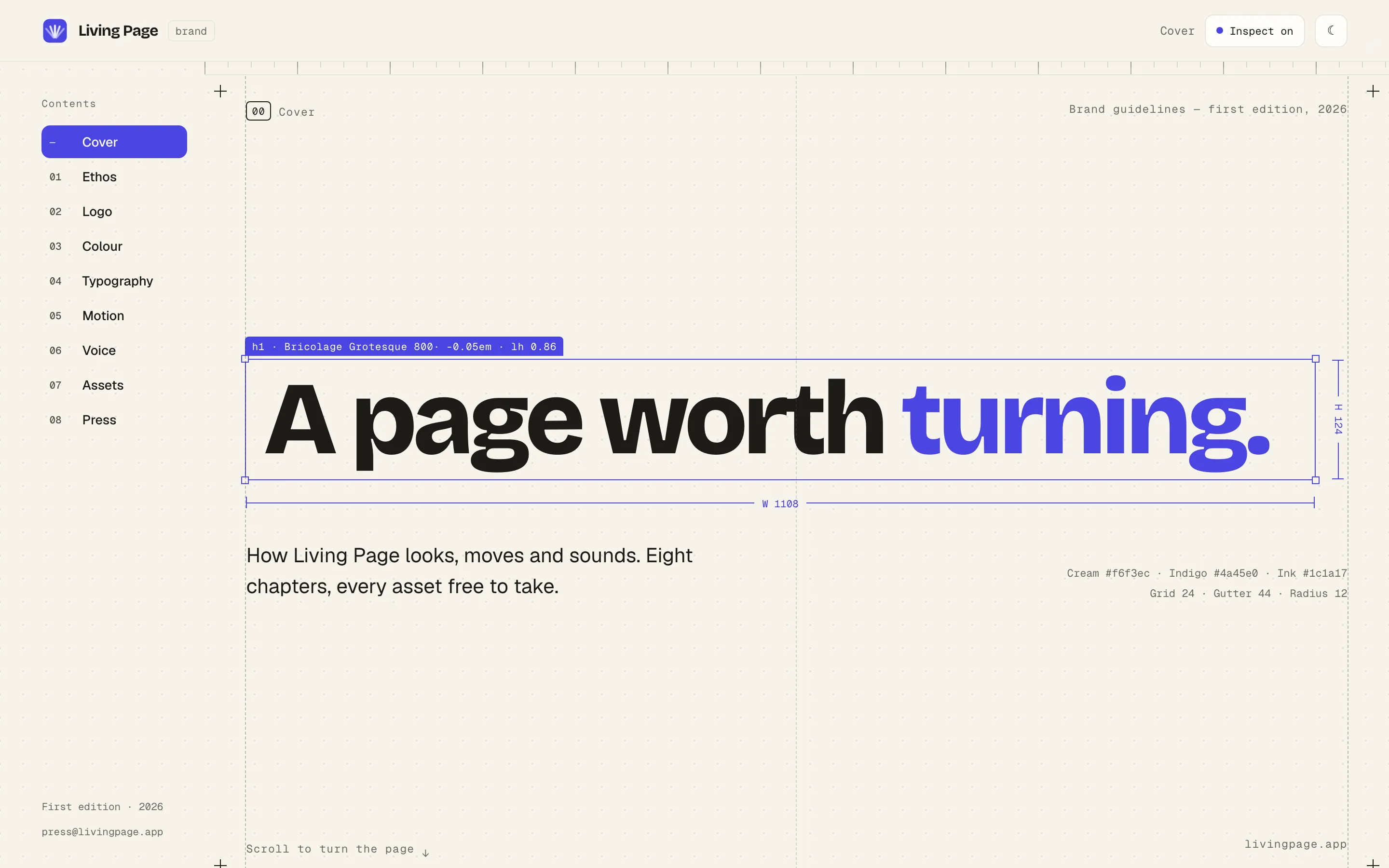
The interesting part is that nothing in it is typed twice
A brand guideline has a specific failure mode. The page tells you the brand indigo is #4a45e0. The downloadable token file says something else, because somebody adjusted one and forgot the other. Now the document is lying, and every asset made from it inherits the lie.
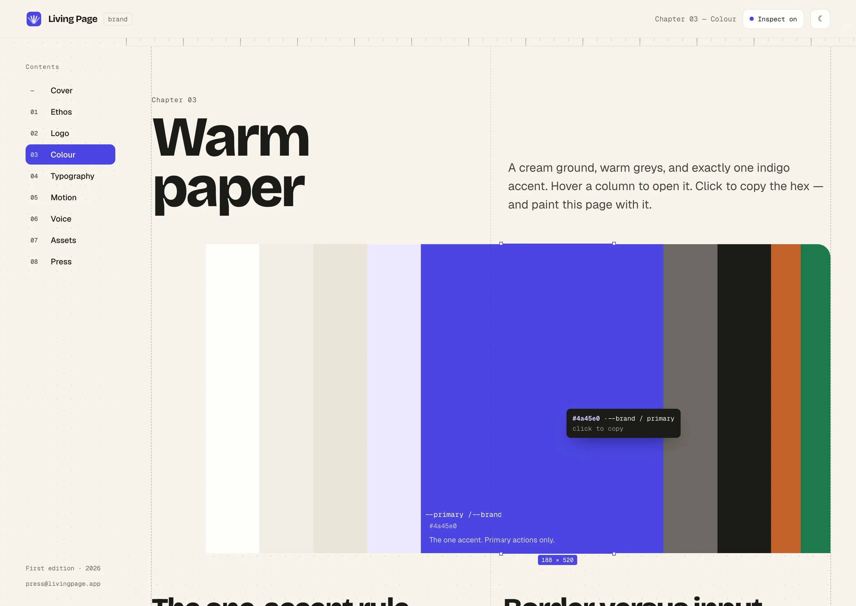
The only reliable fix is to make that impossible rather than to be careful. So every value on the site — the swatches you see, the tokens.css you download, the tokens.json a build pipeline can fetch, the SVGs, the PNGs at three sizes, the social cards, the press archive — is generated at build time from a single file. Change the indigo in that file and the page, the downloads and the generated images all move together, because they are all the same value rendered in different ways.
It means the downloads are ordinary files at ordinary URLs. You can curl the tokens. You can right-click and copy the link. Nothing is assembled by JavaScript when you click a button, which matters when the person on the other end is a journalist on a deadline rather than a developer.
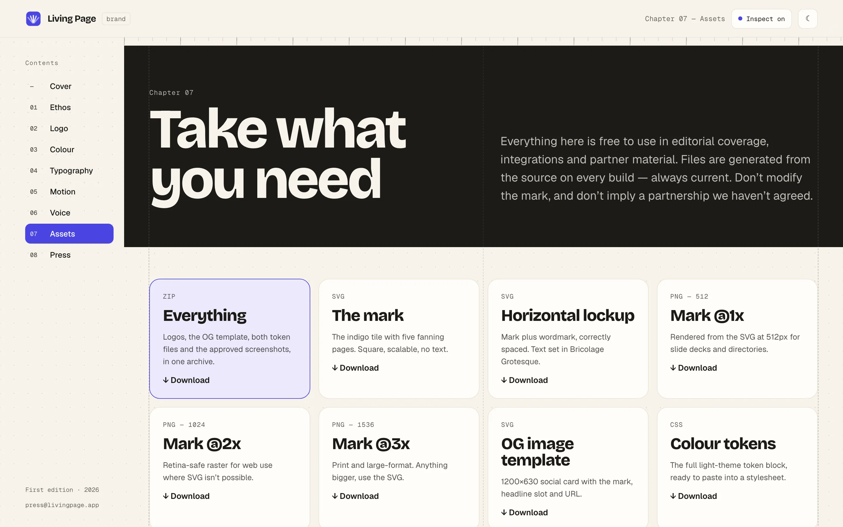
The other thing it does is explain itself. On a desktop you can point at anything on the page and it will tell you the family, the weight, the size, the tracking and the ink it is set in. The site is a specification, and the fastest way to read a specification is to point at the thing and be told.
How the design system got into Claude Design
Separately from the brand book, we had been moving the design system itself into Claude Design — a set of preview pages covering the foundations and the components, so that an early concept starts out already looking like Living Page rather than looking like a generic template with our colours dropped on at the end.
That turned out to be less straightforward than exporting a component library, for a reason worth knowing if you try it: Claude Design renders static HTML, and our components are React with Tailwind. They cannot simply be shipped across. So each preview is a hand transcription of what the component actually computes to, with the app’s own stylesheet as the authority for every value. Thirteen pages: the three foundations — colour, typography, and spacing and radius — the mark, and nine component groups covering buttons, badges, forms, cards, alerts, dialogs, tabs, tables and feedback. Each one shows light and dark side by side, because a token that only works in one of them is a token that is going to embarrass you later.
It is a chore. It is also the whole point. Once it is in there, generating a concept for a new landing page produces something with the right type scale, the right neutrals and the right one accent — and the argument moves on from “is this our brand” to “is this the right idea”, which is the argument actually worth having.
The brand book you are reading about came out of exactly that loop. It was concepted in Claude Design first, then rebuilt properly as a real site.
Concept, then design, then ship
Which is roughly how a new page or a new feature goes here.
Concept in Claude Design. Fast, disposable, and deliberately early. The goal is to see three versions of an idea badly rather than one version of it beautifully. Most of what comes out of this stage is thrown away, which is what it is for.
Design in Figma. Once there is an idea worth committing to, it gets designed properly. Claude Design is very good at getting from nothing to something. Figma is where something becomes a specification — states, breakpoints, the awkward cases, the things nobody thinks about until a real screen is in front of them.
Build, then staging. Every change goes to a staging site before it goes anywhere near customers. Not a preview of the frontend pointed at the live database — a genuinely separate copy of the whole stack, with its own database, its own file storage and its own background workers. Nothing there can touch production data, because there is no wire between them. It means we can break things, upload nonsense, and run migrations for real rather than in theory.
Review, then promote. The staging site is where a page is actually looked at. Not in a design tool, not on a laptop, but at the URL, on a phone, with the real content in it — which is where you discover the headline that wraps badly, or the table that collapses into a column ninety pixels wide, or the figure drawn for a screen nobody is holding.
Then production is a merge. The same code that has been sitting on staging is what ships; nothing is rebuilt, retyped or hand-uploaded on the way. If it goes wrong, it goes back the same way.
None of this is exotic. It is the unglamorous middle bit that decides whether a design survives contact with a real browser — and having somewhere safe to find that out is worth more than any amount of care taken beforehand.
Take what you need
The brand site is public, and the assets on it are free to use for editorial coverage, integrations and partner material. There is a press chapter with the facts, boilerplate in three lengths, and an address that reaches a person.
The one thing we ask is that you take the files from the site rather than from a screenshot or an old email. That is rather the point of building the thing.
Frequently asked questions
- Where can I find the Living Page logo and brand assets?
- At brand.livingpage.app. The mark and the lockup are there as SVG, the mark is also available as PNG at three sizes, and there is a single archive with everything in it including the colour tokens and approved product screenshots. They are free to use in editorial coverage, integrations and partner material.
- Can I use the Living Page logo in my own product or article?
- Yes, to refer to Living Page — in articles, directories, integrations and comparisons. What we ask is that you do not modify the mark, do not use it as your own product or feature icon, and do not imply a partnership we have not agreed. The press chapter of the brand site sets this out in full.
Read next
- The back office: why our admin tool can barely do anythingAt first, the only way to act on an abuse report was raw SQL on the live database. So we built a proper tool early — and made it deliberately limited.
- How we give every document a transcriptEvery document on Living Page gets a text transcript — even scanned ones with no real text. The problem behind it, and the call that kept it fast.
- How we built Pitch Mode: present a PDF, no slidesPitch Mode turns any Living Page link into a live presentation — laser pointer, draw-to-highlight and a blackout key, built into the reader.